Jump to content

New Logo...thoughts?


Recommended Posts

I hate to be the wet blanket here but to me it seems a bit fussy,  could you simplify it a bit?  Less is more, sort of thing.

I can see where you are coming from as that was my first impression.

When I sat back and gave it some thought, I saw it more as an icon rather than just Don's initials, a bit like the movement identification symbols we see on watch movements. I am assuming that when used for advertising purposes it will always have the DJW Custom Timepieces written underneath.

  • Like 1
Link to comment
Share on other sites

I hate to be the wet blanket here but to me it seems a bit fussy,  could you simplify it a bit?  Less is more, sort of thing.


I do hear what you're saying and also agree with you! I'm not 100% convinced that this will be the final design. I think it's close, but will probably tweak it a bit until I'm satisfied. I did, though, print it out on my laser printer at the approximate "Actual" size that would be on a watch dial and I was happy with how the logo itself looked.

The biggest problem with printing it at actual size was the overall amount of letters in the text. I may just shorten it to "DJW Watch Co."

This way I can increase the font size so that it is easier to read and won't take up anymore space than originally designed.


I saw it more as an icon rather than just Don's initials, a bit like the movement identification symbols we see on watch movements. I am assuming that when used for advertising purposes it will always have the DJW Custom Timepieces written underneath.

This wasn't my original intention, but this is exactly how I see it now!  

Link to comment
Share on other sites

I had to do something to fix the "Bosom" look to the logo!

Just a little space added to the "J" seems to satisfy my needs! Also, I found this Font online, which I really like!

Although the style of the Logo and the Font are totally different, I think they play well off each other. Kind of a Modern/Classical pairing...


post-90-0-61675700-1407334937_thumb.jpg

Link to comment
Share on other sites

One of the issues with designing a logo to print on a watch dial is how well does it translate to such a reduced size....

So, I took Will's advice and design (Thank you Will!) and added my own touch.

This one seems to translate the best...And I don't see the need to have anything printed underneath it!


post-90-0-83805100-1407419585_thumb.jpg


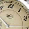
...approximate look on a dial


post-90-0-81312900-1407421511.png

Link to comment
Share on other sites

Join the conversation

You can post now and register later. If you have an account, sign in now to post with your account.
Note: Your post will require moderator approval before it will be visible.

Guest
Reply to this topic...

×   Pasted as rich text.   Restore formatting

  Only 75 emoji are allowed.

×   Your link has been automatically embedded.   Display as a link instead

×   Your previous content has been restored.   Clear editor

×   You cannot paste images directly. Upload or insert images from URL.


  • Recently Browsing

    • No registered users viewing this page.
  • Topics

  • Posts

    • Oh well, if Master @nickelsilver says it's the way to go, then it is the way to go! I stand corrected! 🫡 Are there any other places where you're supposed to remove the epilame from the contact point of rubbing? I don't think so! Thanks for the effort @Neverenoughwatches, much appreciated! 🙂👍
    • If you're seeking advice for your "Harvard GSD" MArch II application essays, I'd recommend taking a thoughtful approach. Reflect deeply on your experiences, passions, and goals, and tailor your essays to showcase your unique perspective and potential contributions to the program. As for resources, I recently stumbled upon a gret platform for essays, and I must say, it's been quite helpful. Their selection of pre-written essays covers a wide range of topics, and their professional writers can also assist with custom essays tailored to your specific needs. Check out their offerings here: https://essaypro.com/essays-for-sale. Remember, authenticity is key in your application essays. Good luck!
    • For clarity and ease of testing, I redid that diagram, flipping the circuit to match the layout of the physical watch.
    • Hello, Thanks for the reply. The old jewel will get pushed out from the "outside" which is the dial side. The new jewel will get pressed in from the inside (shown below) which is the movement side, correct?     And the old jewel and spring will get pushed from the is the "outside" which is the dial side. Thank you very much for the information. I will take out the KIF spring and save it. Will update when the new jewel is in place!   Regards, Joe
    • It's a little circlip style retaining clip to keep the pinion from riding up out of position.
×
×
  • Create New...