Search the Community
Showing results for tags 'adjusting'.
Found 1 result
-
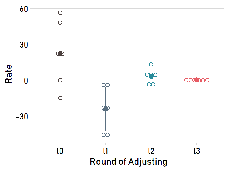
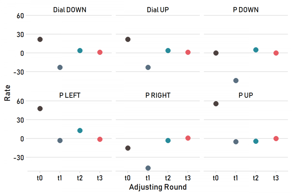
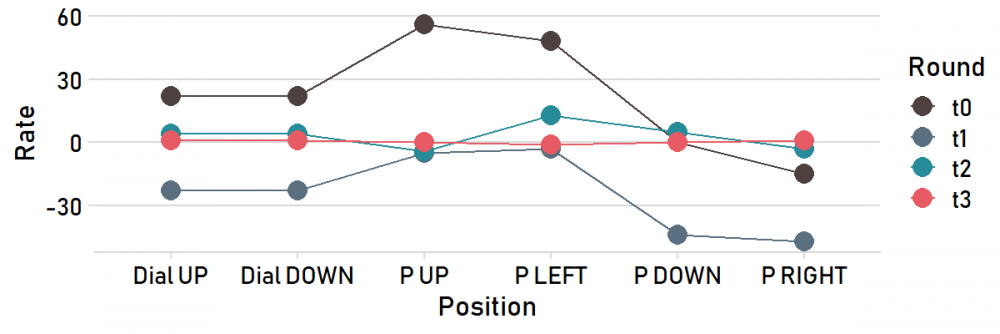
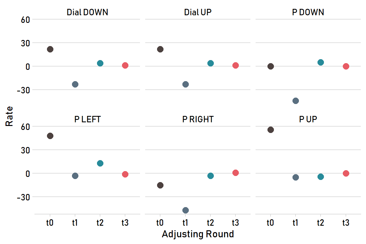
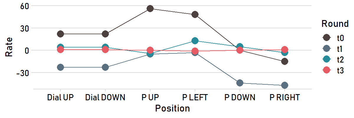
 Adjusting a watch to positions usually involves several rounds of tweaking and tinkering, and I've been interested in different ways of measuring my progress and visualizing how the rates converge. I have been dabbling with R code to visualize how the rates in the 6 positions change after each round of adjusting. I suspect there are a few "data science" types on this board, so I'm pasting the code at the end. If you use R, it is easy to input your own rates. It yields the attached charts. One shows each round as a line. Another highlights each position. And a third highlights each round, marking the average rate and standard deviation of the 6 rates for each round. These are a first pass, so feedback and suggestions from fellow RStudio nerds are much appreciated. # start # library(tidyverse) library(cowplot) library(extrafont) library(ggpubr) library(paletteer) # enter the timing results from each round of adjusting---- Positions<-c("Dial UP","Dial DOWN","P UP","P LEFT","P DOWN","P RIGHT") t0<-c(22,22,56,48,0,-15) t1<-c(-23,-23,-5,-3,-44,-47) t2<-c(4,4,-4,13,5,-3) t3<-c(1,1,0,-1,0,1) # wrangle to proper form for plotting---- df<-data.frame(cbind(Positions,t0,t1,t2,t3)) %>% pivot_longer(t0:t3, names_to = "Round", values_to = "Rate") df$Rate<-as.numeric(df$Rate) # plots---- chart<-ggline(df, x="Positions", y="Rate", group.by = "Round", color="Round", plot_type = "b", point.size = 2.5, xlab = "Position", ylab = "Rate", palette = paletteer_d("ghibli::PonyoMedium", direction=1))+ theme_minimal_hgrid(font_size=12, font_family = "Bahnschrift") chart facet_plot<-ggline(df, x="Round", y="Rate", color="Round", plot_type = "b", point.size = 2, facet.by = "Positions", xlab = "Adjusting Round", ylab = "Rate", palette = paletteer_d("ghibli::PonyoMedium", direction=1))+ theme_minimal_hgrid(font_size=12, font_family = "Bahnschrift")+ theme(legend.position = "none") facet_plot dots<-ggdotplot(df, x = "Round", y = "Rate", add = "mean_sd", color = "Round", plot_type = "b", point.size = 2, xlab = "Round of Adjusting", ylab = "Rate", palette = paletteer_d("ghibli::PonyoMedium", direction=1))+ theme_minimal_hgrid(font_size=12, font_family = "Bahnschrift")+ theme(legend.position = "none") dots # print plots---- png(filename = "lines.png", width = 6, height = 2, units = "in", res = 200) chart dev.off() png(filename = "facet.png", width = 6, height = 4, units = "in", res = 200) facet_plot dev.off() png(filename = "dots.png", width = 4, height = 3, units = "in", res = 200) dots dev.off() # END